Colours: The Meanings
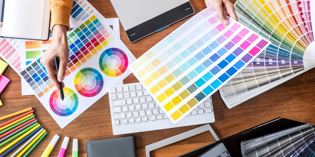
Posted by Obet AkrisChoosing the right colours will make your business POP! Wrong combinations can give reverse effects. There is something called colour psychology which says colours can impact our emotions and behavior. This emotions and behavior based on our perceptions and historical experience, our senses and brain records everything and makes this called perception psychology. Choosing right colours for your Brands, Visual Marketing Theme, even Office Walls can affect people’s behavior who see it. This can be used for signage too. Please see the colour disc in this link if you need a guide to mix and match.
Black
Black is the absence of light. This color is as old as light itself. Black is luxurious, mysterious, bold, strong, simple, elegant, and powerful.
White
White is the presence of all light spectrums. White is pure, holy, clean, beginning, innocence and coolness. White also used for most modern brands which want a simple clean atmosphere.
Red
Red is associated with fire and blood. In the old times red was used for war flags. Red is health, passion, energy, bravery, love, desire, and determination. Other than that red gives most attention as it has the shortest wavelength. Red can be used to show warnings, dangers, and attentions.
Orange
Sweet and sour, red and yellow, that’s orange. Orange symbolizes creativity, joy, freshness, happiness, warmth, and compassions.
Yellow
The colour of sunrise. Yellow used to show prosperity and friendship. Yellow should be used with extreme cautions because it affects people a lot. Too much will make people impatient and too little will give people insecurity. However, you can have it in different tones like goldish or ochre which have more warmth, luxurious, mature, and comfort feels.
Green
As fresh as vegetables in spring. Green is a symbol of a healthy environment, earth, growth, freshness, nature, a new life, safety, fertility and wealth. Dark green will give more earthy, low profile feels. Be careful not to have yellowish dark green too much as it will give people rot and a dirty environment impression.
Blue
As deep as sea, as high as sky, as strong as waves, as striking as lightning, as calm as night. Blue has a lot of meanings as its tones. Dark blue is deep, calm and trustworthy. Vibrant blue symbolizes electricity, technology, and satisfaction. Light Blue symbolizes purity, peace, freedom and imagination.
Purple & Violet
Purple and violet is a rare sight in nature. It is mysterious, sacred, delicate and precious. In the other hand purple and violet are associated with venom, poison, dark magic and evil intention.
Pink
Soft, beautiful, and passionate. Pink is the “impossible colour”. Pink is made from red and violet spectrum which is the shortest and highest wavelength. Pink symbolizes love, passion, beauty, female, romance, and tenderness. Beware not to use too much vibrant pink as it will give people headaches. Make it softer for more romantic feminine and motherly feels.
Brown
Brown is the colour of earth. Wood and soil. Actually, brown is a muted dark orange colour. Brown is mature, royal, luxury, expensive, classy, vintage, and wealthy.
Gray
Actually, gray is light black. There are 3 types, cool grays (bluish), warm grays (Yellowish) and natural gray. Gray represents metals, silver, wealth, high technology, sharpness and trust.
see also


