3 Important Elements in Creating Vintage Signage
Posted by Ayu
Many people have a true love for vintage and retro design. Even though a vintage design looks ‘old-fashioned’, but its aesthetic design styles give you the nostalgia of your good old memories. For millennial youngsters, you don’t have to live through an era to understand its aesthetic design. Some even consider this vintage design as fashionable and eye-catching.
Vintage signage is also beneficial, potentially even essential for certain businesses allowing your message to stand out. With vintage signage, you can entice people to your message in an authentic and creative manner. Its unique and interesting designs allow you to encapsulate an entire tone, feeling, and notion, levelling up your signage to go above and beyond just displaying information or a brand. Here, we’d like to share 3 important elements in creating vintage signage.
1. Appropriate fonts
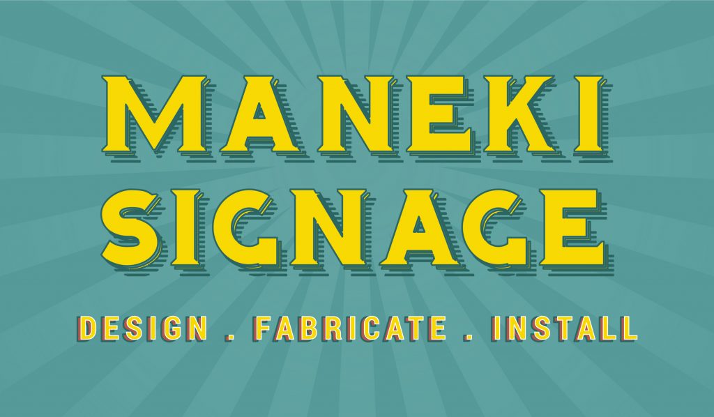
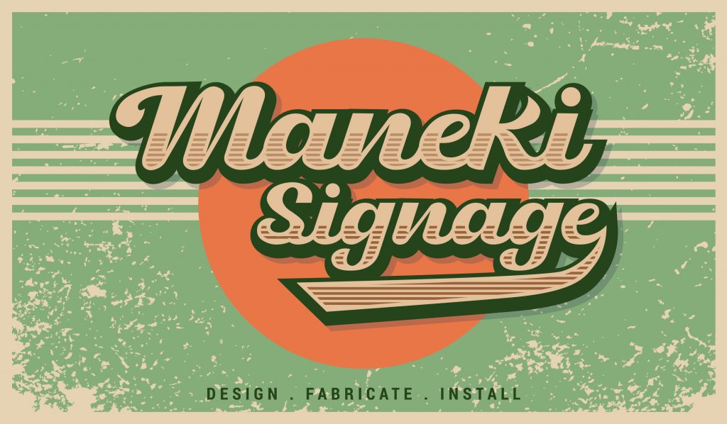
For a good vintage signage, you need good vintage style fonts. The right font will reinforce your brand and image. When it comes to readability, it is important to pick a background color that helps the font stand out. Also, consider your audience. Make sure people can read your sign without too much squinting and effort.
Note that there are a lot of fonts that will bring an aged feel to your designs, but high quality free fonts are hard to find – especially when it comes to vintage style fonts. Why bother yourself? In Maneki Signage, our professional designers are ready to help you choose the best vintage style font for your signage. Below are some samples of the popular vintage style fonts:
2. Color choice
Your color choice can change a modern design to something inspired by past years. Many vintage signs are rendered in bright colors. In the 1950s design, colors were often muted with reds, teals, mints, and taupe tones being used often. Using these colors in your design is beneficial when you are trying to make it obviously inspired by the decade to your audience or clients. In the 1960s design, pastel colors were more popular. While neons and light bulbs were often used in the 1980s and 1990s.
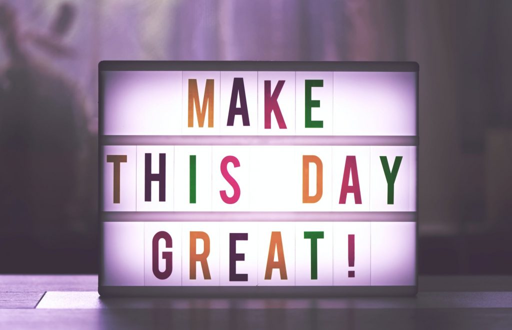
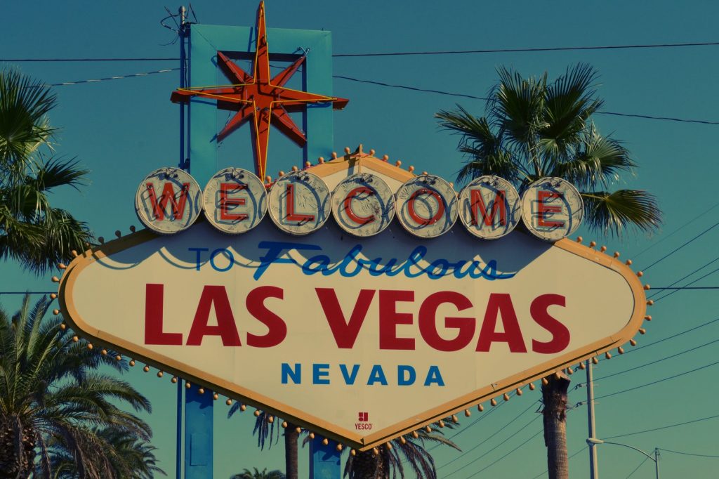
3. Vintage-style bulbs
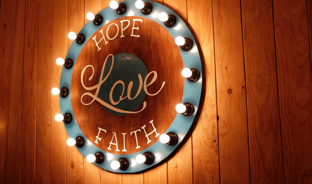
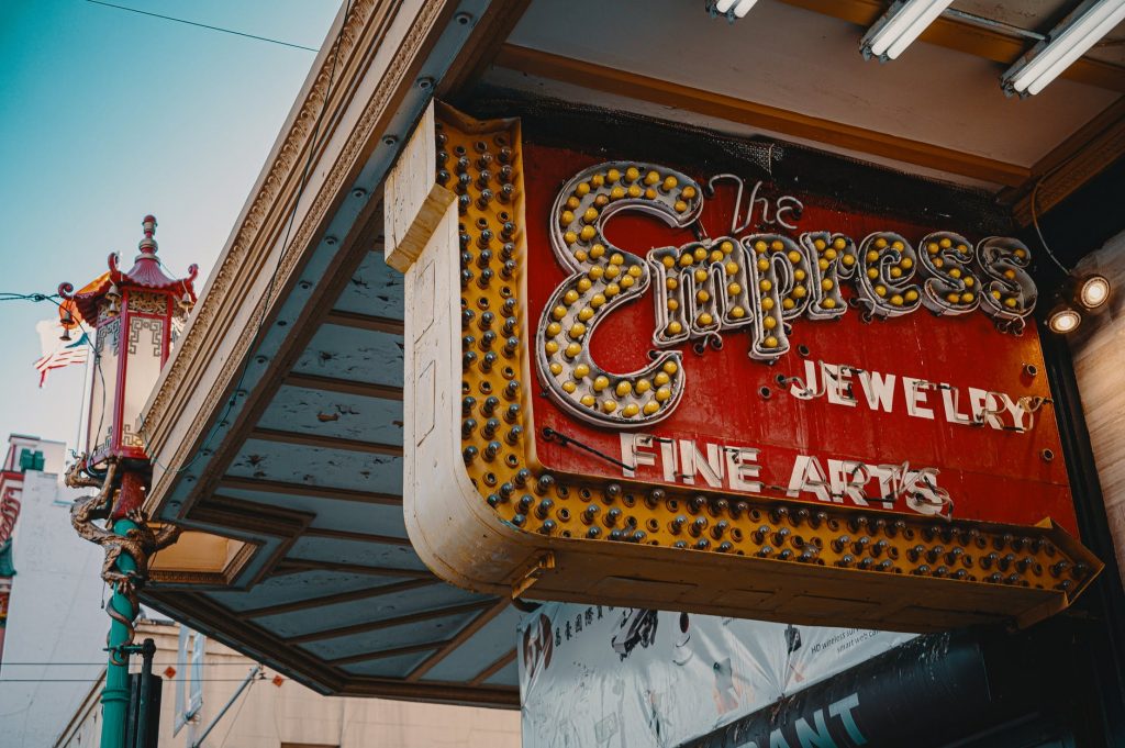
Vintage-style bulbs were once popular at diners, movie theatres and casinos. You could see them being used as chase lighting or even in open-faced channel letters. Vintage-style bulbs started out as a nostalgic novelty for people who weren’t ready to say goodbye to the incandescent bulbs getting phased out by the rising energy standards. These bulbs are often intended for exposed bulb setups, they are made to be looked at. For that reason, a lot of them are intentionally less bright or even looked yellowy. Most vintage-style bulbs use the color temperature way down in order to boost up the old-school aesthetic.
