Posted October 21st, 2016 by Donovan
Poster advertising has been around for centuries. Of course, it has changed dramatically in styles and tones but it’s still around because it still works. So how do you create a poster that stands out in the crowd of advertising? Here, we’ll go over 5 ways to make that happen.
1. Color Pallet
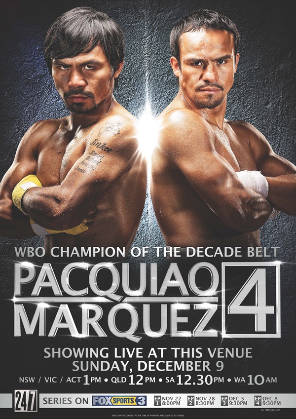
Poster Design Example 1
This is probably one of the most obvious things to go over. That is why it’s crucial. Getting that bright or dull look depending on what your ad is for is very necessary. It’s what sets the tone. For example, if you’re advertising a ballet you’d go for something elegant and a rock show would have explosive color and dark tones. Blocks of color for retro-style ads or even gray and black tones for a more serious ad campaign. Your color choice is critical.
2. Visual hierarchy
If you are posting something with a lot of information, it’s important to have a big, bold title to catch the eye and make the lettering bold and interesting to look at. This will keep them reading. Group the information into blocks for easy reading. It’s important to guide their gaze where you want it. There are literally countless ways to do this. Remember, art and advertising are about guiding the people to you. The key is to guide their eyes to what you want them to see most without them realizing it.
3. Typography
Experiment with many fonts and styles to nail the look of your intended ad. With food, for example, you could write words with the actual food and have a clean, bold block of text on the image for easy reading of your advertisement. Draw in their attention with your creativity. Getting the writing on your ad to look just right is critical. You’d be surprised at the attention people pay to eye-catching lettering.
4. Location Importance
This tip is probably one of the most important rules to follow. Location, location, location. Getting the right permissions to have your fantastic ad posted in the right traffic and display areas will make or break your attendance goals. This is the most common sense tips and also the most overlooked. The rule of location is one of the most fundamental and oldest of them all. Walls next to ‘impulse buy’ sections are a fantastic area for this.
5. Less Can Be More
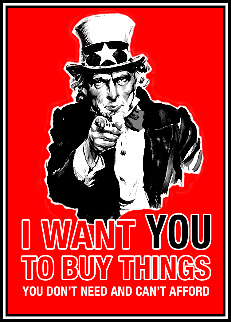
Poster Design Example 2
Learning to use negative (empty) space in the poster is a fun and creative way not only to guide the eyes but to cleverly do more with less. By forming the shape and leaving the inside blank it draws the eye into the negative space. This is a great way to bring their attention right to the text or to another image inside the empty space. It’s a fantastic way of creating something where nothing is there. It’s one of the oldest illusions in art to date.

Guest Writer: Jessica Kane
Jessica Kane is a professional writer who has an interest in graphic design, marketing, and printing. She currently writes for 777 Sign.
Posted April 11th, 2016 by Donovan
The information provided in this article is intended you help Singapore businesses better understand Braille signage and accessibility sign standards, and links directly to international (ADA) and local (BCA) documentation containing all the technical details on compliance.
Chances are that if you use a lift in Singapore, you’re already somewhat familiar with Braille signs … as they are found on every lift button in Singapore. This is because BCA’s code on accessibility has long maintained that lift upgrades include accessibility signs for the blind and visually impaired.
But did you know that as of 2014, BCA requires building renovations to include the installation of certain Braille signage to assist individuals with a visual handicap navigate the building? At present, handrail Braille signs that communicate the floor level in each direction and at each end of a staircase are mandatory, and we are sure the list of Mandatory Braille signs will be extended in future to convey other information to users.
As international Braille signs are costly to obtain and don’t necessarily comply fully to BCA’s requirements, we aimed to become a market leader in Braille signage by extending our production technologies to include tactile accessibility sign production.
So that explains the ‘why’ part about Maneki Signage’s move to provide superior Braille signs to the Singapore market. But another equally important question is the ‘how’ part. After all, Braille signs are hardly a new invention, and there have been many innovations in how Braille signage is manufactured globally. Let’s cover the three most popular Braille signage manufacturing methods used today:
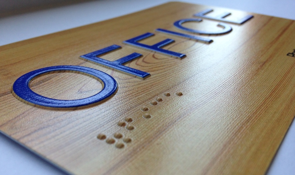
Braille reverse-engrave / insert method
- Machining passes required: 3
- Durability: 2.5/3
- Tactility: 3/3
- Variety (material/color/graphics): 2/3
Braille reverse-engrave/insert production method
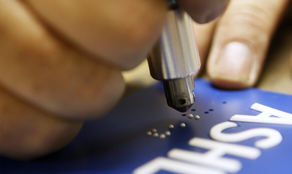
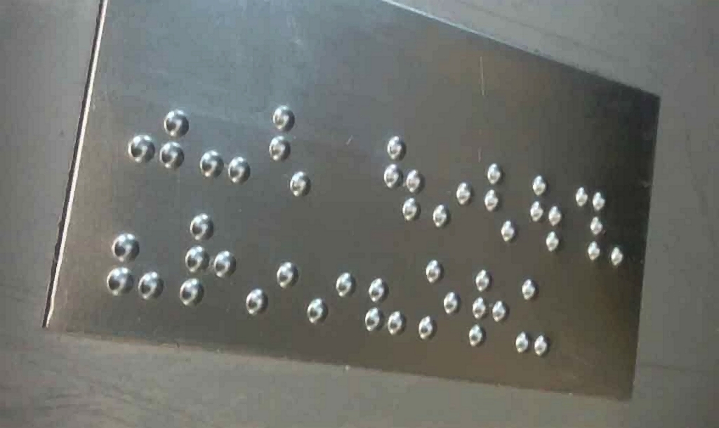
Traditionally, Braille signs started out as one of various substrates into which holes are drilled into whatever Braille pattern is desired. Braille pellets or small ball bearings are then punched into the holes to give the desired raised dot effect.
This method is very durable and can be provided in various materials and colors, thanks to spectrum of colors Braille pellets are available in. Provided a precision Computer Numeric Controlled machine is used (as we use at Maneki Signage), and the correct drill bits and quality stainless steel ball bearings are used, the durability can rival that of the Braille stamp method in everyday use.
The Braille insert method, though, does have a slower and costlier production process as compared to the next two methods, but we insist on this manufacturing process to ensure durability (and we back it up with a 1-year guarantee against material failure).
Finally, this method does allow for raised graphics (as required by the ADA and BCA). These are separately machined from PVC sheets and permanently adhered to the sign surface, creating smooth, raised pictogram and lettering in a variety of colors. Due to the cheapness, abundance, and durability of the raw materials required for making this type of Braille sign, the cost to produce higher quantities of this type of Braille sign is the lowest of all methods covered in this article, and ensures the second highest overall durability (second only to the ‘stamp’ method).
Braille stamp method
- Machining passes required: 1
- Durability: 3/3
- Tactility: 1/3
- Variety (material/color/graphics): 1/3
Braille stamp production method
The Braille stamp method uses a series of metal stamps that are driven into either a metal or plastic sheet at high force to permanently create an impression on the opposite surface. This method is the same as how the raised numbers are stamped on Credit Cards.
The selection of materials and colors compatible with this method are more limited, as certain materials simply cannot be stamped to form an indent (wood being a perfect example). Also, the base material used must be thin, so as to get the best possible indentation. For this reason, materials thicker by only a few millimeters may produce little or no raised surface once stamped and graphical shapes are much harder to achieve as each graphic requires its own metal stamp—and these are costly tools, so graphics options are limited when using this method.
Furthermore, this method produces reduced tactility when certain materials and material thicknesses are used, due do the way the stamp deforms the material—which forms a radius between the braille peak and the surface of the material. This can reduce tactile feedback for people who are still learning Braille and developing their sensitivity to reading Braille signs out in the real world—where there are a lot more distractions than what someone may be used to when reading Braille at home.
So despite this method offering the highest durability, it simply does not conform to our expectations of what a quality, easy-to-use Braille sign should be. And, as such, we do not offer this option.
And finally, due to the manual process involved in setting up the stamp layout and activating it (usually via a manual hydraulic press), this method tends to be laborious and costly, resulting in longer lead times and reduced savings.
Braille 3D UV printing method (discontinued due to durability issues)
- Machining passes required: 1
- Durability: 1/3
- Tactility: 2/3
- Variety (material/color/graphics): 3/3
Braille UV-print production method
Despite this method of producing Braille signs becoming more popular nowadays and offering intricate colors, graphics, and gradients for Braille signs, our own internal testing of the durability of UV-printed Braille signs resulted in us producing a limited production run and then (after 6 month’s of internal testing) abandoning the technology in favor of the reverse-engrave/insert method. 3D UV-printing has too many limitations to make it the de facto method for producing quality Braille signs. Here are some of the major limitations:
1. Expensive and uncommon materials – special types of acrylic and aluminium sheets treated with a special primer to ensure even a moderate level of adhesion of the ink to the surface. The much greater cost of these specialized materials (and no readily-available local supply) means that the price of producing Braille signs in this way is more expensive than the other two methods covered.
2. Fragile in the best of circumstances – UV-cured ink decays rapidly in outdoor conditions and will only carries a 6-month, highly-conditional manufacturer guarantee for indoor conditions only. The UV-printed Braille dots are particularly prone to falling off over time and when subjected to stresses that are inevitable in a real-world scenario (such as someone accidentally brushing up against the sign mounted on a handrail, or children playing with the Braille dots).
3. Meticulous manufacturing process – Despite requiring only 1 machine pass to produce, the UV-printer needs to be operated in near laboratory conditions. Any dust will drastically affect adherence by interfering with the primer or ink; the UV-cured in itself needs to be kept in constant flow to prevent clumping, and even after a successful print, the curing process may not be complete and more time is needed in sterile conditions with the right type of lighting to ensure the ink actually sets hard.
With all the aforementioned limitations of UV-printed Braille discovered in our 6-month long trial run of the technology, we had no choice but to discontinue use of this method in favor of a more cost-effective and durable alternative right for the Singapore market.
In closing
We at Maneki Signage are proud to support the blind and visually impaired community in Singapore as well as the thoughtful legislation by the BCA.
If you need any Braille signs to complete your renovation project, visit our Braille sign catalog for online ordering. If you have any questions about our Braille signage products, or want to see a physical sample, contact us (click the floating button on the right edge of the screen) to arrange a site visit or consultation for all your Braille signage needs.
Local and international standards our Braille signs comply with:
Posted November 14th, 2014 by Donovan
At Maneki Signage, we have seen the industry change from hand-drawn designs traced from logo’s projected onto majong paper, to the introduction of CNC (computer numeric controlled) devices such as routers and laser cutters. And now with the relative affordability of digital signage, there can be no question that technology will continue to revolutionise the signage industry.

Maneki Signage 3D virtualisation process
For permanent signage, one really has to have a clear view of how the final design will carry and represent one’s brand to the public. Photoshop designs can only go so far and do not reflect how the actual materials chosen for a sign will alter the final appearance of the product in various lighting conditions.
For companies that are just starting out and need to focus intently on getting their branding done correctly, knowing exactly how their photoshop design will look when the actual sign gets installed at their premises is crucial to their budget and professional image.
So as part of our modernised strategy, we have adopted rapid virtualization technology to give our customers a photo real preview of what their sign will look like—using state-of-the-art 3D rendering technology. That’s right! No ‘approximation’ drawn in photoshop or ‘example’ from our gallery, but the actual design and how it will look in real life!
On top of that, we can take any site photos supplied by our customers and digitally draw in the signage they ordered from us, so they know exactly how the end result will look.
We also offer this service as a standalone option, and you are under no obligation to purchase the final signage from us. We will be happy to help you perfect the design and placement, which you can then have created by your preferred signage supplier, if necessary.
This sort of service has never before been offered in the Singapore signage market, and we are extremely proud to be the first signage company to give our customers a perfect mental picture of what they are buying—which helps them present their brand exactly as they wish to.
So next time your company needs signage, why not skip the tedious face-to-face consultations, vague previews of what you are actually purchasing, and hand-written invoices? Try Maneki Signage and see what makes us Singapore’s most advanced online signage supplier!
Posted October 29th, 2014 by Donovan
Signage has been a persistent element throughout human civilization. There is not one nation, culture, or tribe which does not use some insignia to brand itself with. Even the advent of the digital age has not rendered this ancient human practice outdated—it has merely altered the canvas on which we continue to make the marks that distinguish our identity, products, or services from those of others.
Baring this in mind, it is with some forethought and caution that one has to approach the practice of signage. Proper signage is a necessity for any brick-and-mortar or online business—it is the only way to project their existence to their target audience. The way that existence is projected, directly impacts potential business.
If a customer finds themselves craving a donut for lunch from a variety of unknown bakeries that recently opened up near their workplace, they would, in all likelihood, choose the one with the most impressive signage—unless, of course, there was one bakery with a line of several dozen people in front of it.
Distinct, professionally designed signage will always lure more interest (and, thus, business) to your brand. Humans are naturally drawn to visually striking scenery—and stripped of its signage, your business is just another concrete structure.
That is the reason why, for example, McDonalds spends so much on the signage decorating every one of its franchises. One would think that a brand so globally established and well known has long ago lost the need to be so strikingly visible wherever it is found. But the reality is that McDonalds uses vivid signage to elevate its brand like an oasis in what then becomes a desert of competition.
Any frequent traveler will testify to a variation of the following story. While ‘roatripping’ in a foreign land and successfully avoiding breakfast and lunch out of pure unfamiliarity with the local cuisine, a clearly distinguishable McDonalds, lit up in the middle of an otherwise colorless district peppered with unknown food stalls and shops, proved the safest gamble for a satisfying and familiar meal.
But without signage such visual distinction, McDonalds would just as soon be glossed over by the hungry adventurer as any other brown shed. The same holds true for your business … or any business.
Ultimately, the imperative to eat would soon drive the famished tourist to eat a barely recognisable dish from a store picked for having a somewhat comforting and reputable look to it (branding and signage at work, again).
But one needs not only look at desperate situations to see the value of branding and portraying it clearly with signage.
Even when someone is walking around a mall looking for something as commonplace as a wooden hammer, they are naturally drawn to the impressive looking hardware store standing next to its blandly styled competitor—unless some prior familiarity or brand loyalty overrides instinct.
The above examples are universal, and have been demonstrated throughout history, and will remain a familiar tale long into the future. A visually distinct business is more likely to get a neutral person’s attention (and thus their money), than if it were generic in appearance. This means increased business for the lifetime of the brand—just from getting its signage right, the first time!